data visualization
As a designer I wanted to challenge myself to create something truly dedicated to the people--to spread awareness about a dire, real, and serious event that is happening in the world.
Research
In a time of war and devastation, we often get stuck in our own bubble and neglect those in need. I wanted to educate myself on the Israel vs. Gaza conflict that has been ongoing for many years and so I used this project as a means to become more well informed and hopefully help spread awareness on the issue. I used AI to guide me through various resources, finding the reliable and unbiased or if it is biased, a perspective from both sides.
AI, Your Turn
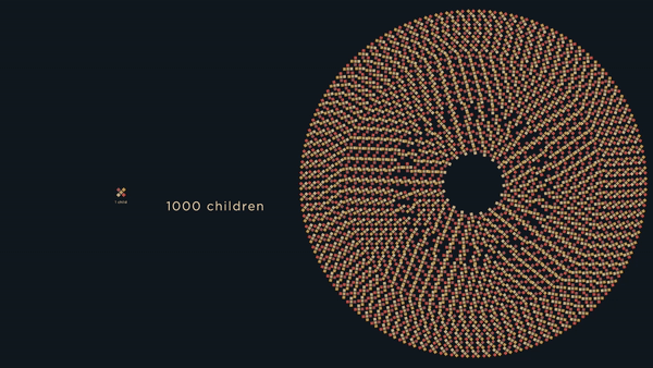
I used AI softwares such as Microsoft Power BI, Polymer, Graphy, Akkio, etc. to help me generate charts based off of the data I had accumulated. I found that a lot of these sites were great at analyzing the given data and showing me patterns and analytics; however, for visual variety, it was actually Graphy that was most helpful to me! I think if I were doing something more complex related to finance or business maybe the other AI softwares would have been more applicable. I just needed a graph that would show the heartbreaking amount of casualties and displaced families in the most effective way possible.

Design References
I was inspired by the traditional embroidery and patterns of both cultures symbolizing resilience and the stories of the people. To honor the dead and to honor what still remains.

Figma Prototype
I had used Figma previously but I tried out Figma Prototype for the first time for this project in order to take my viewers on an interactive journey as they experience the research and history behind this war.
